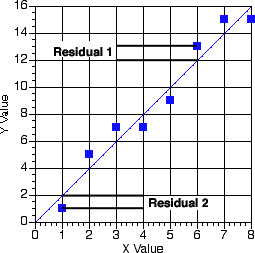
Figure 13.1(t) Best-fit line on Linear Graph paper
| Boomer Manual and Download | ||
| PharmPK Listserv and other PK Resources | ||
| Course Index | ||
Figure 13.1(t) Best-fit line on Linear Graph paper
Notice the residuals (only 1 and 2 are marked) in Figure 13.1 represent distances that are about the same magnitude. That is, about one unit on the y scale. The line is drawn to minimize the total residual.
The situation changes somewhat if we use semi-log graph paper. Remember on semi-log graph paper each decade takes up the same space on the graph paper. That is, data values between 100 and 10 are spread out (in a vertical direction) and take up as much space as data that might fall between 1 and 0.1. Therefore when we put a line through data drawn on a semi-log plot we tend to emphasize to points with the lower values. Residuals at higher concentrations are much higher than the residuals at lower concentrations even though they look to be the same on semi-log graph paper.
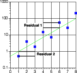
Figure 13.2(t) Best-fit line on Semi-log Graph paper
In Figure 13.2, residual 1 is the difference between 27 and 54 or 27 units whereas for residual 2 the difference is between 1 and 0.5 or 0.5 units. However, on semi-log graph paper these difference appear to be the same. The best-fit line is drawn to minimize 'weighted' residuals. In the case of the semi-log plot the lower values have more emphasis.
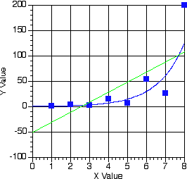
Figure 13.3(t) Data in Figure 13.2 Plotted on Linear Graph Paper
In Figure 13.3 the data from Figure 13.2 are plotted on linear graph paper. The green line represents the 'linear' best-fit line. The blue line is the best-line from the semi-log plot.
When we use a computer program to 'draw' the best-fit line through the data we need to be able to tell the program how much emphasis or 'weight' we want to give to each data point. If we know or can estimate the variance (= standard deviation squared) of each data point we can weight the data by the reciprocal of the variance.
Equation 13.1(t) Weight as a function of Variance
For some data sets the variance is essentially the same for each value for others the variance varies with value measured. Wagner (Wagner, J.G. 1975. Fundamentals of Clinical Pharmacokinetics, Drug Intelligence Publications, Hamilton, IL p289) describes a general equation for variance.
Equation 13.2(t) A General Equation for Weight as a Function of the Data Value
Equation 13.3(t) A General Equation for Variance as a Function of the Data Value
Taking the log of both sides of Figure 13.3 gives Figure 13.4
Equation 13.4(t) log(Variance) as a Function of the log(Data Value)
As described by Wagner (1975) a plot of log(Variance) versus log(Data Value) can provide a straight line with a slope of 'b' and an intercept of log(a).
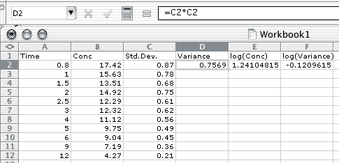
Figure 13.4(t) Data Entered on an Excel Spreadsheet
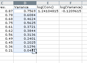
Figure 13.5(t) After fill-down in Columns D, E, and F
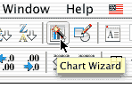
The next step is to select cells E2 through F12 and use the Chart Wizard
 to generate a XY (Scatter) plot of the data. Don't forget to select XY (Scatter) plot as the type. Selecting all the defaults should result in a graph similar that in Figure 13.6.

Figure 13.6(t) XY (Scatter) Plot of log(Variance) versus log(Cp)
With the Chart (graph) selected choose 'Add Trendline...' from the Chart menu. Select the linear trend and click on the Option tab. Check 'Display equation on chart" in the options and click 'OK'. This produced the equation:
y = 2.0211x - 2.6238
Thus the slope 'b' is 2.0211 and the intercept log(a) is -2.6238 leading to a value for 'a' of 0.002378. In Boomer choose the fourth weighting scheme ('3') and enter the a and b when asked. In SAAM II use the GEN weighting function and include (GEN 0 a b) at the top of the data table in the Data window, replacing the a and b values with your numbers.
P.S. You can download my Excel Spreadsheet here.