Using a JAVA aware browser you can create your own version of Figure II-5. For many calculations involving rate constants you will
be determining the slope of these lines. The second and third graphs
(Figure II-4 and Figure II-5) are a lot easier to use in terms of
calculating slopes than Figure II-3, since they each represent a
straight line. Later we will look at the equation for this line.
Semi- log graph paper has a normal x- axis scaling, but the y- axis
scaling is proportional to the log of the number not the number
itself. It saves you from taking the log of each number before you
plot it.
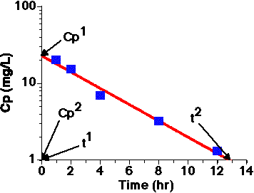
Example use of semi-log graph paper: Plot the data, draw a
line"through the data", and calculate the slope of the line.
Table II-2 Example Cp versus Time Data
Time (hr)
1
2
4
8
12
Cp (mg/L)
20
15
6.8
3.2
1.3
Figure II-6. Semi-log Plot of Cp versus Time
A best-fit line is drawn through the data points and extended
to the extremes of the graph paper (for better accuracy).
Values for Cp1 and Cp2 are read from the
y-axis and t1 and t2 values
are read from the x-axis.
These values can be used to estimate a value for kel (see Chapter IV).
Equation II-1
For practice you can graph these data on
linear or
semi-log plots and draw best fit lines through the data.
Compare your answers with the computer!
Drawing a best-fit line through the Data
Drawing a line through the data doesn't mean through just two data points but through all the data points. Be especially careful about picking two adjacent data points. Sometimes the first and last point can work but the last point, the lowest concentration data point will probably be inaccurate. The best approach is to put the line through all the data. There should be points above and below the line.